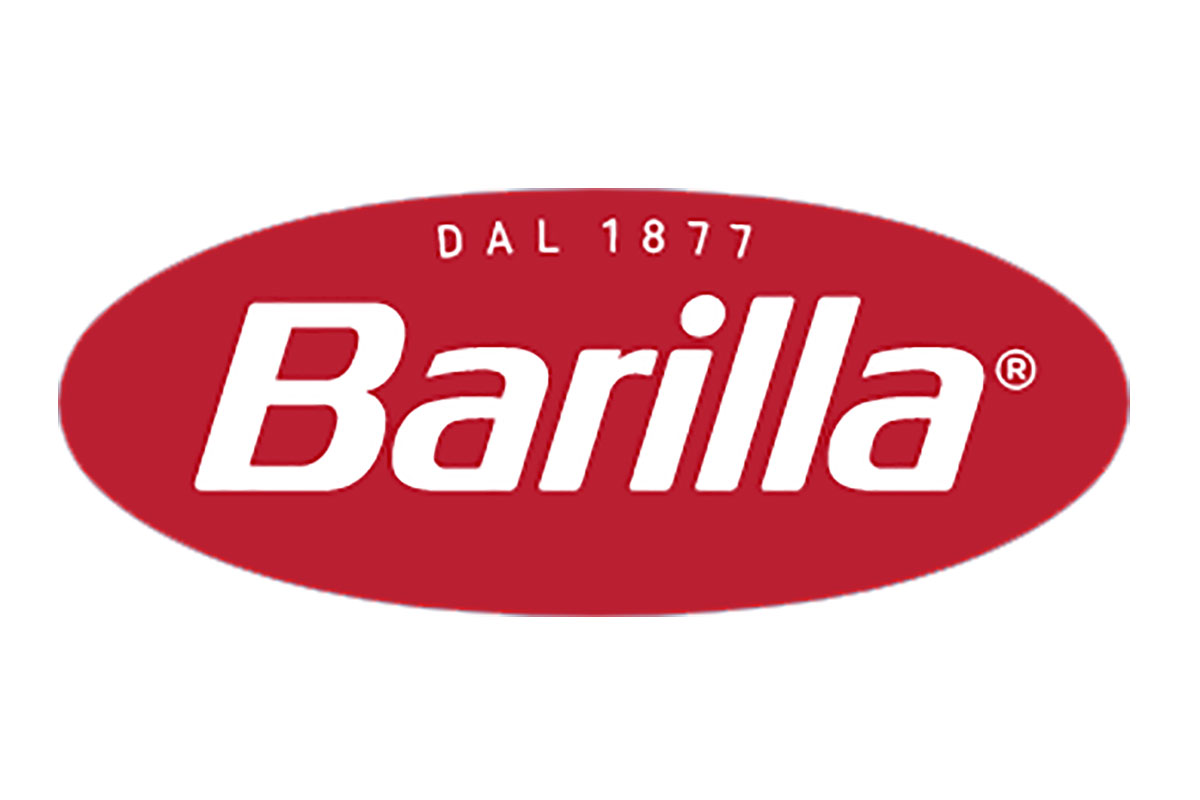
The announcement came on Barilla’s social media profiles with these words: “Something new is cooking in Barilla and we’ve already caught your attention. We’re just getting started”. The news is the launch of the new company logo, which by now is only visible on the Italian multinational company’s website. The official presentation, along with the announcement of other news, is scheduled for January 26.
DARK RED BECOMES PROTAGONIST
The new logo does not change the image that has characterized it for over 60 years, but it does present some important innovations. First of all, the white outline disappears while the red remains, with a darker tone. Above the “Barilla” wording, which changed font but is still in italics, the year of foundation appears: 1877, to underline the long history of one of the world’s food icons.
A BRAND WITH A LONG HISTORY
In almost a century and a half of activity, the Parma-based food group specializing in pasta, bakery, and sauces has changed its image several times. The archiviostoricobarilla.com site tells the story of its evolution, specifying that the first logo appeared only in 1910 when the first Barilla factory was producing 80 quintals of pasta a day.
The most important change dates back to 1952. Barilla entrusted Erberto Carboni – that year’s winner of the golden award of advertising for the Pasta Barilla campaign in cinemas – with the task of rethinking the brand logo. The idea of a “stylized hard-boiled egg” cut in half with the Barilla writing in Bodonian characters, which has remained almost unchanged until today, was born.
